The Persistent Fool
My client, who goes by the pseudonym: The Persistent Fool, came to me seeking a brand for her new persona. Having been given the gift of a fresh start from the pandemic, she was ready to start her new career in writing and blogging. Through our discussions I came to realize that I wasn’t branding the blog as much as I was branding The Persistent Fool herself. She talked to me about how she wanted this brand to represent her struggles with discovering spirituality, mental health, trauma, recovery, addiction, and the metaphysical. The main challenge of this project was how to tie this medley of concepts together in one cohesive visual style, which I thought was most effectively accomplished through a warm and mysterious collage of photographs, ephemera and rich earthy hues.
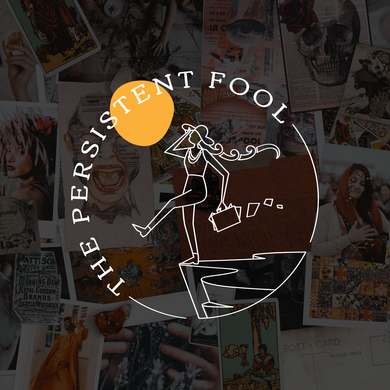
The Persistent Fool came to me with a clear idea in her mind of what the subject of the logo would be: the fool as seen on a classic tarot card, but carrying with him books and trudging onward straight off of a cliff with the sunlight in his eyes. My initial sketches focused more on a medieval woodblock printing style with a male subject. As the versions progressed we decided that a woman would be more appropriate for the brand, and decided to take the imagery in a contemporary direction. The final version is a stunning monoline emblem with a shock of colorful yellow in the place of the sun. Because of the detail included in the final logo, a smaller solid emblem with the PF initials has been included for use.
The thepersistentfool.com website is a simple site with blog and about pages. The simplicity was implemented in order to create room for later additions like a podcast page, book sales landing page and order form.


